


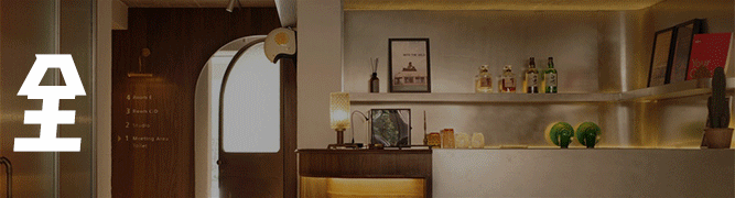
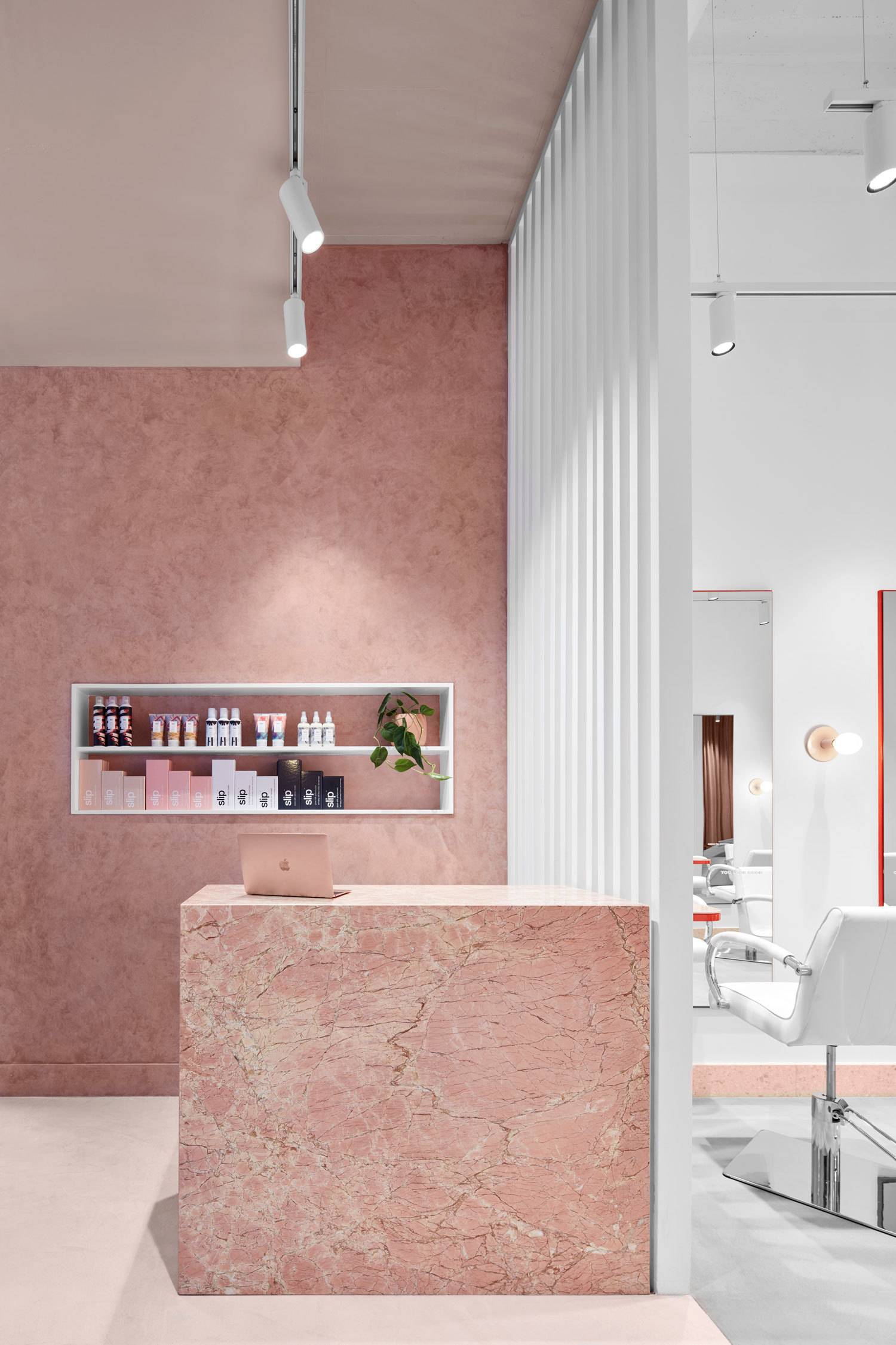
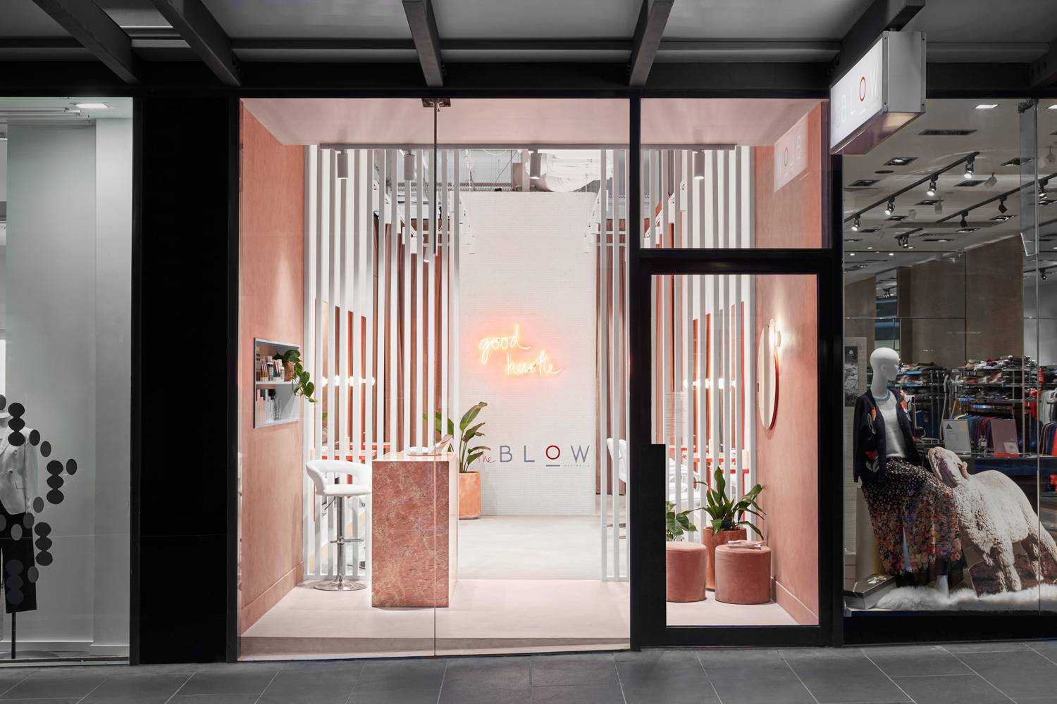
沙龙空间的粉色装饰设计
室内设计吸引了游客的注意力,是BLOW品牌个性的物理体现,建筑结构成功地体现了他们的核心价值——清新、快速、女性化、大胆和现代。
Designed to captivate the attention of the visitors, the interior is the physical embodiment of The BLOW brand personality, with Tecture successfully embodying their core values – fresh, fast, feminine, bold and modern.
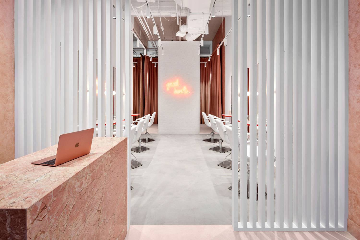
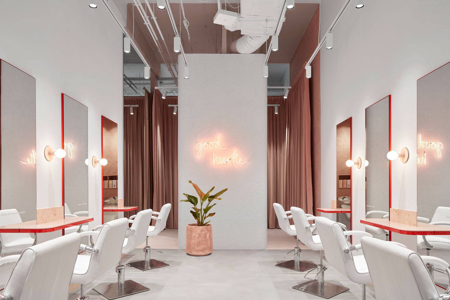
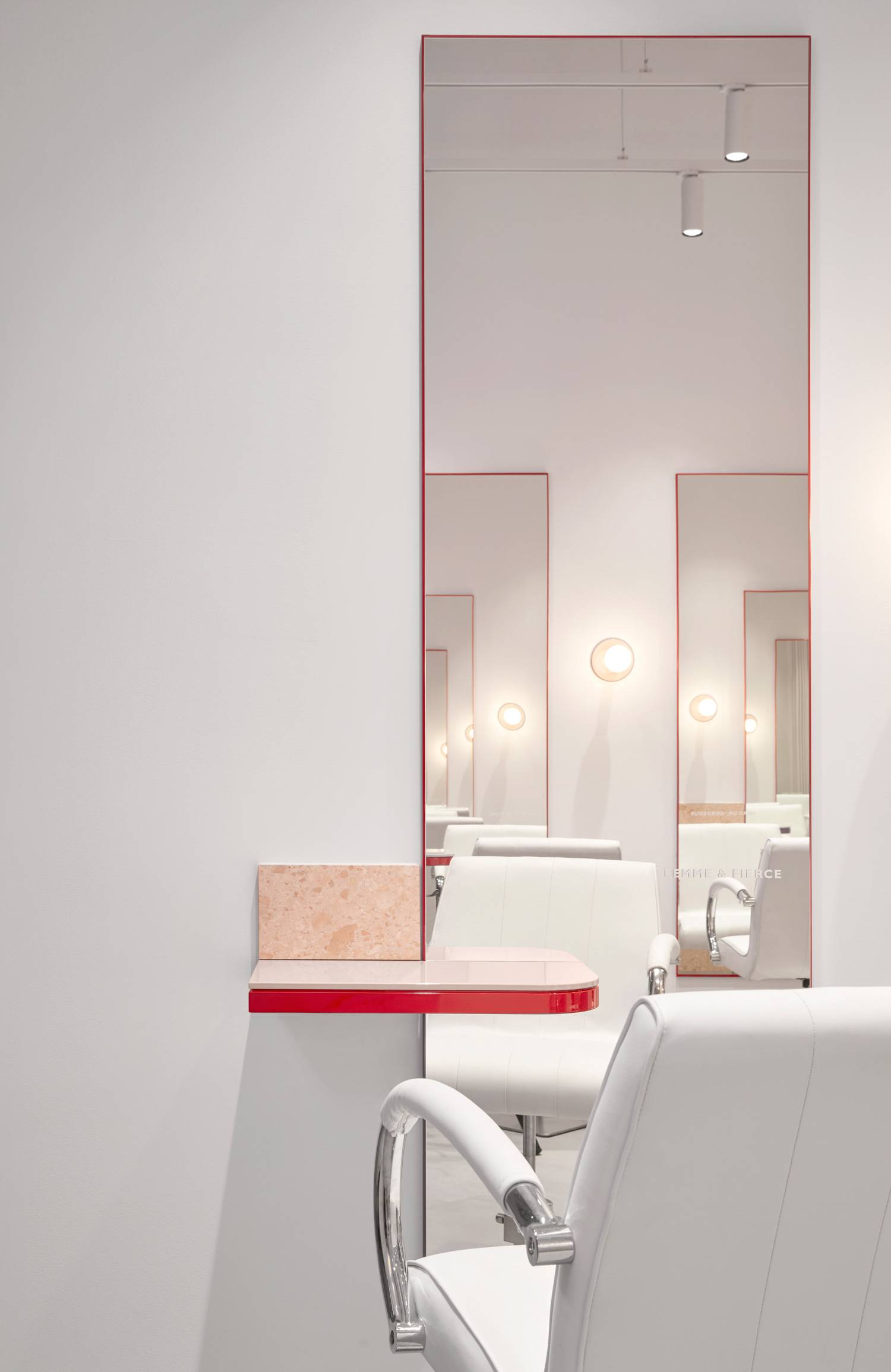
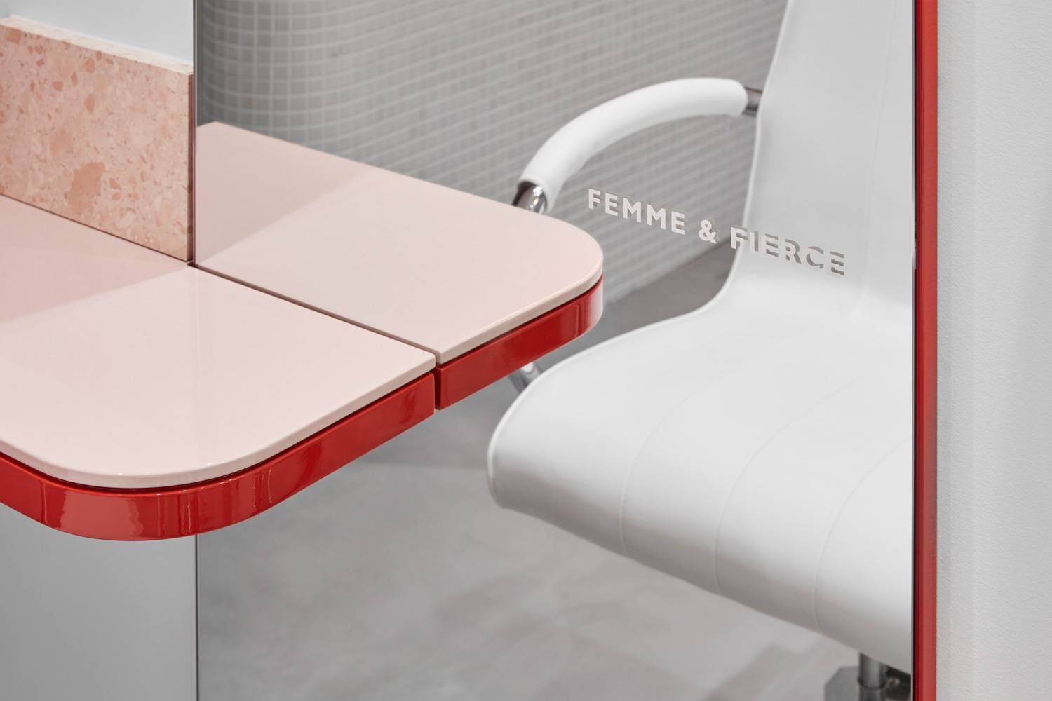
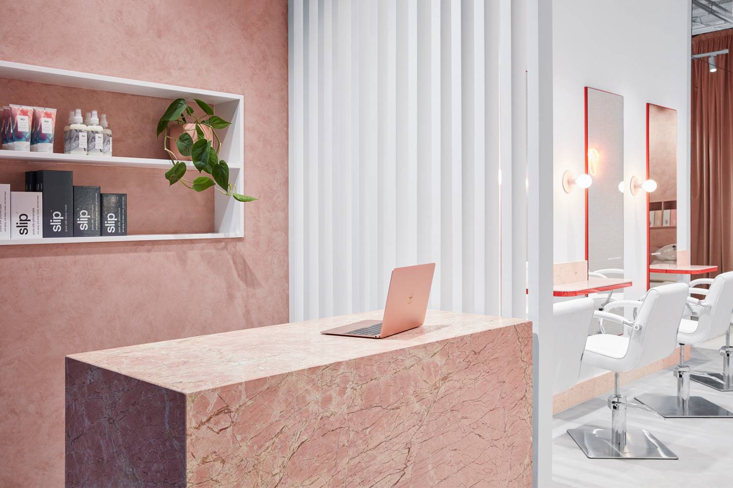
弹药粉的标志性颜色被用来把小租约分成三个不同的区域。前台是接待处,中间是工作站,后面是洗漱台。粉色的水泥地板,粉色纹理的墙壁,粉色的天花板,粉色的大理石前台。
The signature colour of Ammo Pink is used to break up the small tenancy into three distinct zones. There’s the reception at the front, the workstations in the middle, and the wash stations at the back. Pink concrete floors, pink textured walls, pink ceiling, and a pink marble reception desk all signal that “you have arrived”.


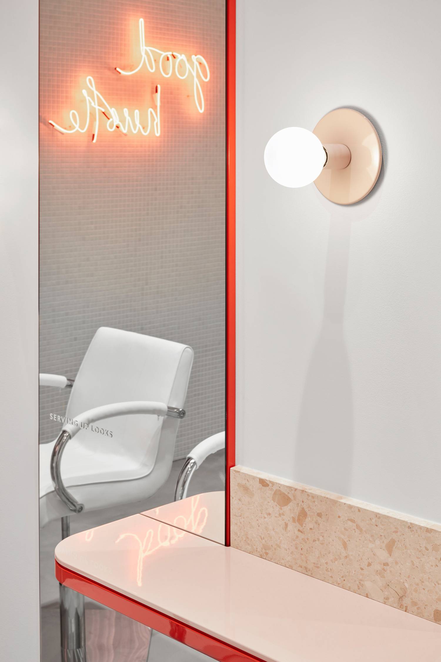
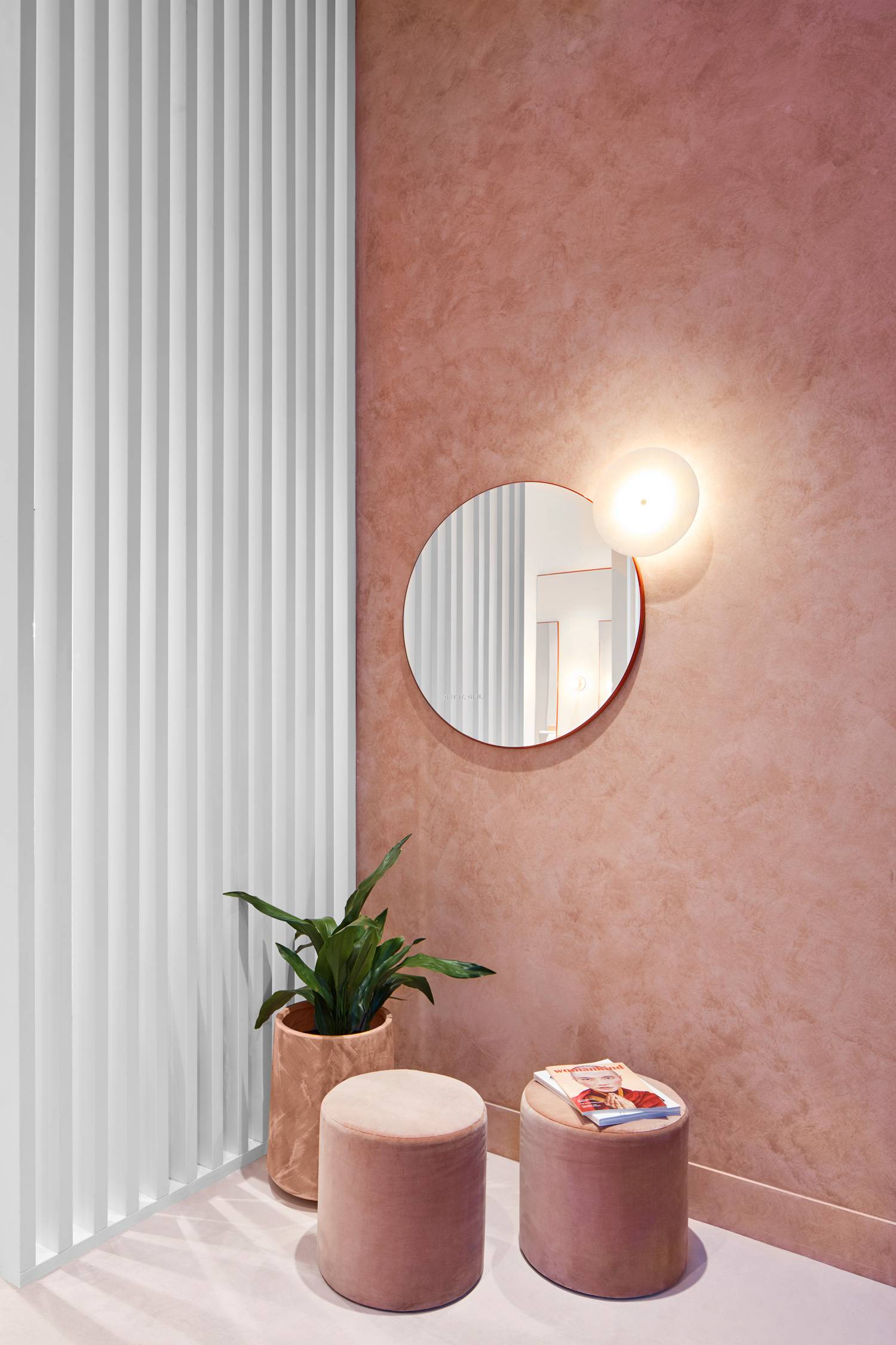
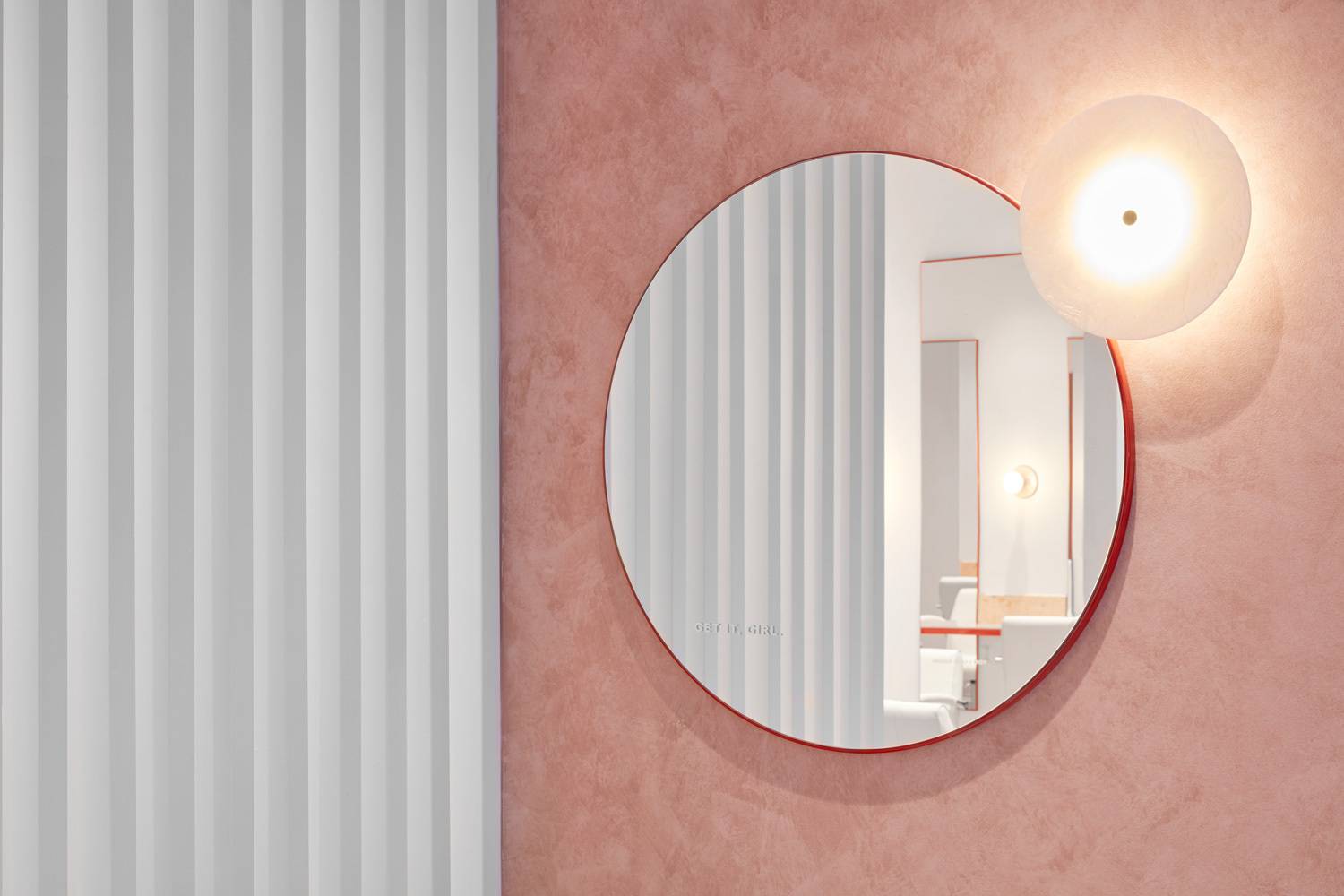

垂直的板条屏风和马赛克墙,带有红色的霓虹灯标志。

以下内容需要登录观看
登录
 复制链接
复制链接
 微信扫一扫
微信扫一扫


